Loading in another tiny second
Healink
Be Better, Everyday
- PRODUCT | BRANDING | STRATEGY | CONTENT | ADVERTISING
Building India's Widest Healing Platform
The relationship started with Healink being just a thought inside Jessica’s (Founder, Healink) head - to create a space for individuals to explore and experience alternative healing practices. We built that thought into a brand now called Healink. We extended this thought to a brand embodying the personality of a supporter, archetyped as a Caregiver in the Sage. Healink is a one stop platform for holistic healing modalities aiming to empower people to be better, everyday.
Bringing Healink to Life
We designed Healink's visual identity in a way that not only complements but elevates its personality and message.
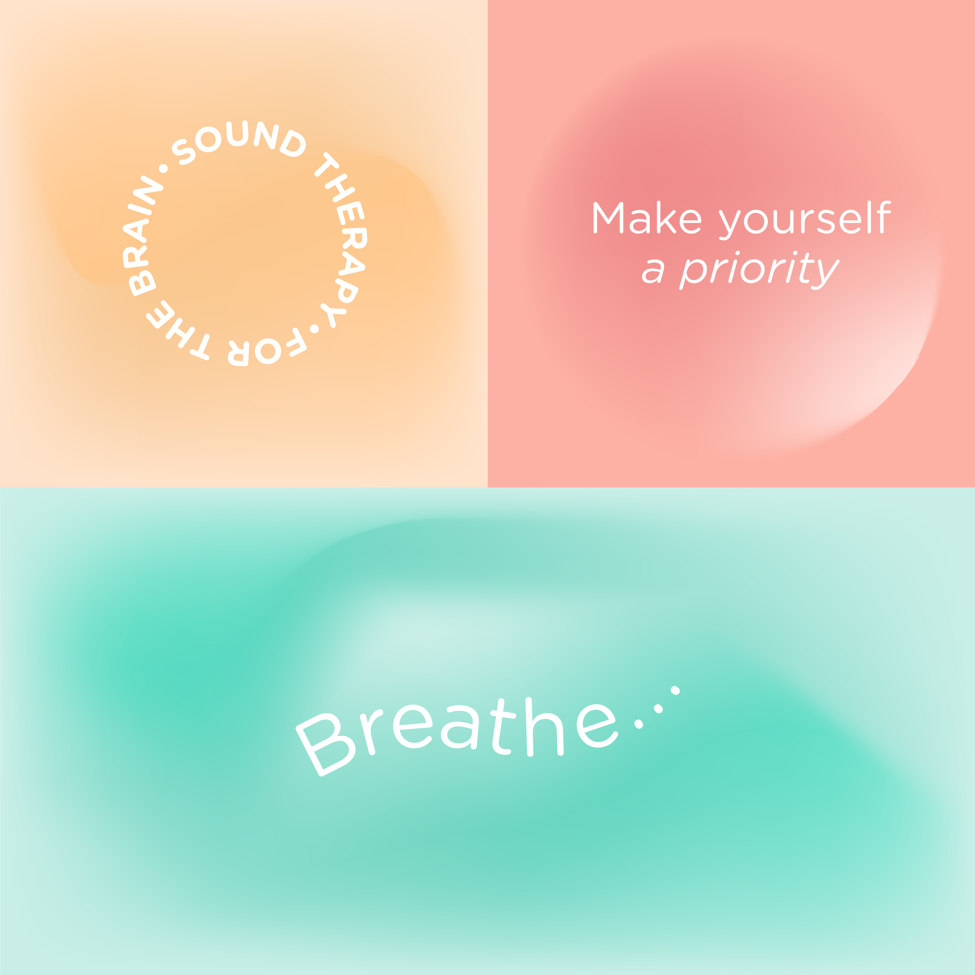
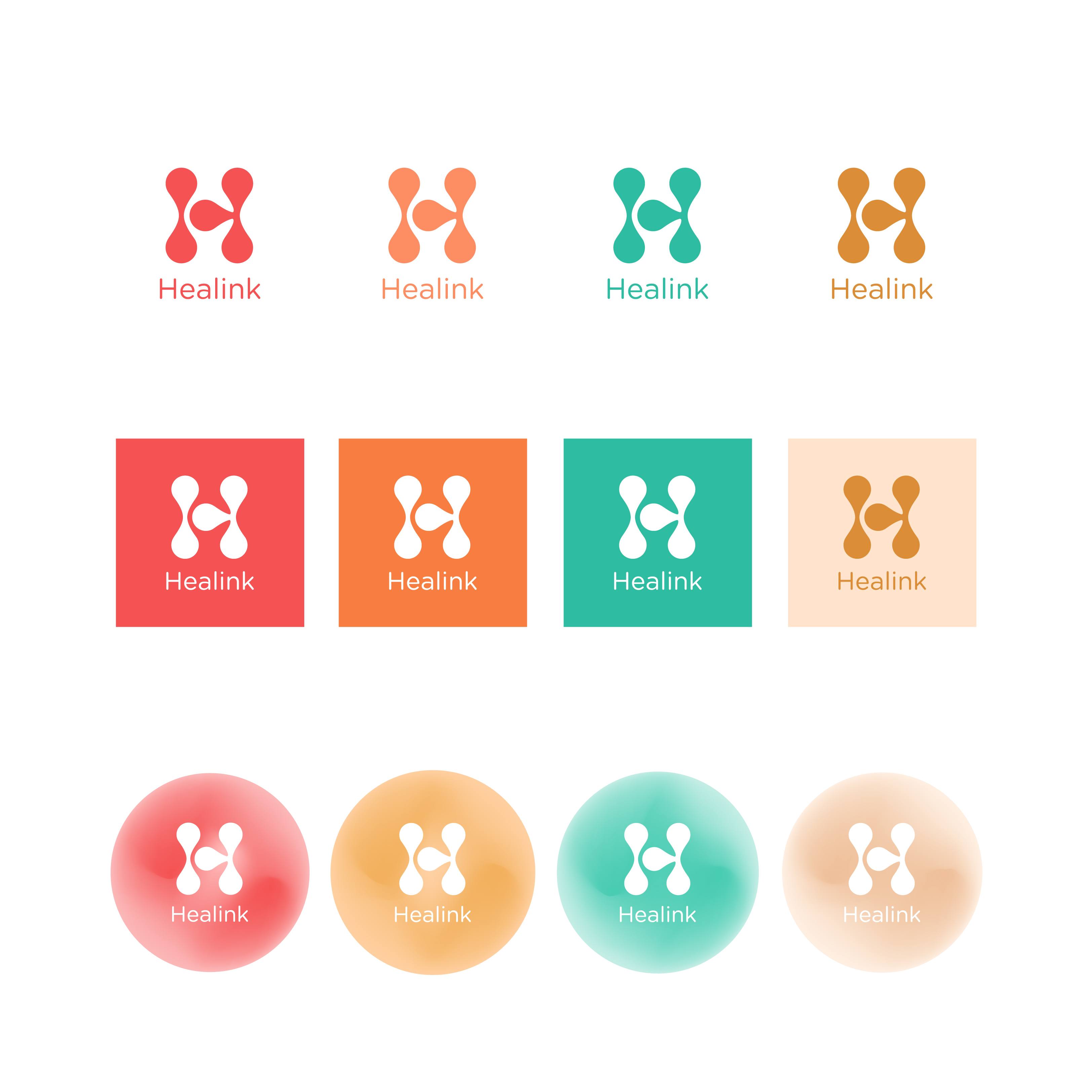
To reflect the friendly, soothing, affirmative, and progressive personality of the brand, we have built a colour palette of bright and easy-to-eye shades.
Pastels accentuated with a secondary palette of bold colours to highlight conversations
Our approach for the brand font was to keep it approachable, simple and consistent.
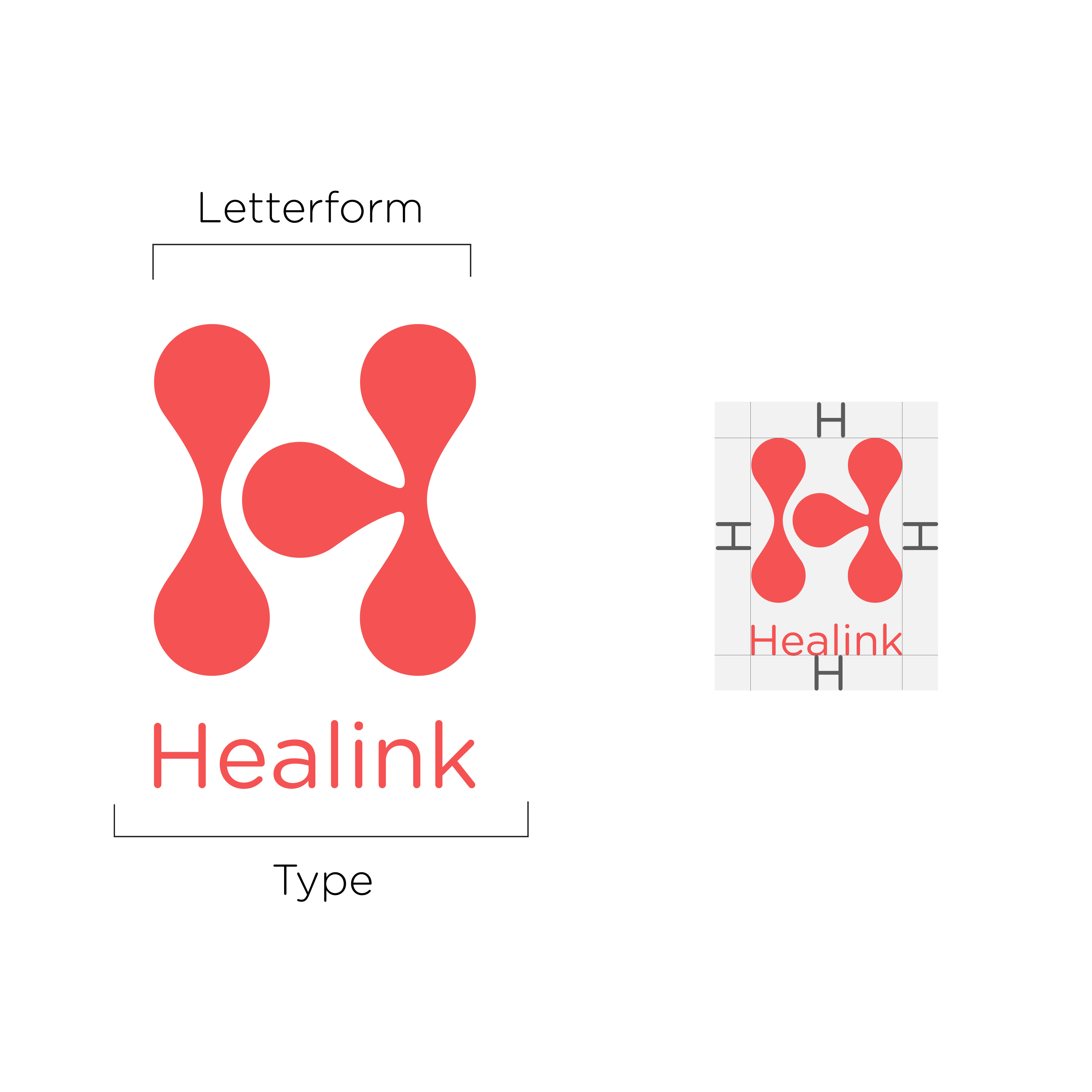
The logo is an H letterform inspired by circles connected in a fluid form to symbolize connectivity and approachability.
Product Building - Website Development
Our approach for the website was simple - it should be
A) welcoming and comforting to feel like a safe space for seekers, and
B) convenient to navigate for seekers and healers.
With our research and creative strategic thinking, we crafted a convenient user journey and a beautiful and empowering user experience for seekers and healers.
Get. Set. Launch
With Healink being a novel platform, we began with a soft launch.
When we closed the launch phase, Healink had over 20 registered healers and over 700 website visitors.
Communications
The recipe for communication strategy we developed contains 3 key ingredients - Strategic interventions to build a long term brand image, tactical efforts for consistent eyeballs, and omni-channel campaigns to maximise visibility.
Our ads and content led to 80% of website traffic from social media with an engagement rate of 30% and net follower growth of 20%.
MORE ADVERTISING


